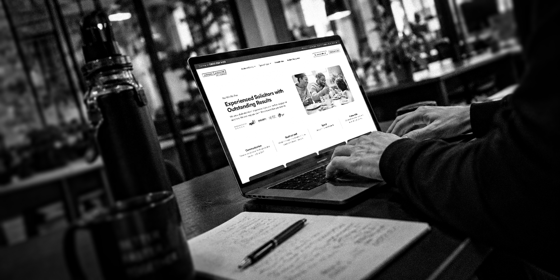
Website design for lead generation: what actually drives enquiries

A website can appear professional, feel credible, and attract steady traffic, yet still fall short when it comes to generating consistent enquiries. On the surface, everything seems to be functioning. Potential customers are finding the site, engaging with content, and spending time there. But the step from interest to action isn't happening at the rate it should.
The reason is rarely obvious. It typically isn't about how the website looks or how much traffic it receives. It's about how effectively the experience helps potential customers reach a decision they feel confident making. That's what separates a website that passively supports the business from one that actively contributes to growth.
When the real question isn't volume, it's fit
There's a natural instinct, when enquiries aren't following traffic, to respond by driving more traffic. Increase the ad spend. Test new channels. Expand the reach.
But if the website isn't converting the visitors it already receives, more traffic simply means more potential customers encountering the same friction. Investment goes up, and results don't follow proportionally. The inefficiency compounds rather than resolves.
There's also a second issue that traffic won't solve. Even when enquiries do come through, they're often inconsistent in quality. Some are genuinely interested and a good fit for what you offer. Others aren't sure what they're enquiring about, or whether you're the right match, or what they'll be committing to if the conversation progresses. Sales time goes into qualifying when it should be going into progressing.
Both problems, low conversion and inconsistent quality, point to the same underlying issue. The website isn't doing enough to help the right potential customers feel ready to act, and to help the wrong ones self-select out before they reach the form.
The website as a continuation, not a starting point
Potential customers don't arrive at your website with blank expectations. They come with context shaped by everything that happened before: the ad they saw, the content they read, the recommendation they received, the search they ran. They may have partial information, unanswered questions, or assumptions that need confirming.
The website's job isn't to start the conversation from scratch. It's to continue it effectively. That means answering the questions potential customers are actually arriving with, filling specific gaps in their understanding, building trust that may not yet be established, and guiding them toward a decision with the confidence to act on it.
When the website fails to do this, potential customers are left to piece things together themselves. They may not find the information they need. They may not encounter proof that addresses their specific concerns. They may not see a clear path forward that fits where they are in their evaluation.
This is where enquiries are lost. Not because the website looks bad, but because it isn't doing enough to bridge the gap between where potential customers are and where they need to be to feel ready to take the next step.
Different potential customers need different next steps
One of the quieter mistakes in lead generation is treating every visitor as if they're at the same stage.
Someone who's just started exploring isn't ready for the same commitment as someone who's compared options and narrowed their choices. Someone referred by a trusted peer arrives with different context than someone who proceeded from a paid ad. A repeat visitor returning for a specific piece of information has different needs from a first-time visitor trying to understand the basics.
When every call to action assumes the reader is ready to book a call, early-stage potential customers bounce and late-stage ones are left without clear next steps. When the site acknowledges and supports these different stages, the experience becomes more generous. Early visitors find what they need to continue exploring. Later-stage visitors find the context that makes reaching out feel earned.
This isn't about burying the primary conversion point behind gates and soft CTAs. It's about making sure that by the time someone reaches a commitment, the groundwork for that commitment has been laid.
What website design for lead generation actually involves
Designing a website for lead generation isn't about adding more forms or scattering calls to action across every page. It's about structuring the experience so potential customers feel genuinely ready to take the next step when they reach that point.
This requires messaging that communicates clearly enough for potential customers to quickly understand what's being offered and whether it's relevant to their situation. It requires structure that reflects how potential customers explore and evaluate rather than how the business organises its services internally. It requires proof, reassurance, and context appearing at the moments where potential customers need them, not confined to isolated sections they may never reach.
Research from Baymard Institute on form usability demonstrates how quickly unnecessary complexity affects results. Even small increases in form effort correlate with measurable increases in abandonment. The more work required, the fewer potential customers complete the process.
The path to action also needs to align with where potential customers are in their decision process. When the experience acknowledges and supports different stages, the website becomes an active participant in lead generation rather than a passive destination.
Understanding your customers before optimising anything
If your website isn't generating the enquiries you expect, the starting point isn't analytics. It's understanding.
Before examining where potential customers drop off or which pages underperform, make sure you genuinely understand who's buying and why. What problems are they trying to solve? What questions do they have at different stages of their evaluation? What concerns might prevent them from taking action? What would make them confident enough to proceed?
Without this foundation, data becomes a tool for validating assumptions rather than revealing what actually needs to change. You might optimise the wrong things, or misinterpret why certain patterns exist.
With customer understanding as context, the data becomes meaningful. You can examine how potential customers move through the site and interpret those patterns through the lens of what you know about their needs and decision-making process. Gaps between what they need and what the experience provides become visible.
Where to focus for meaningful improvement
Improving lead generation rarely requires a dramatic redesign. It requires identifying where the experience falls short of what potential customers need and making targeted improvements.
Start with where potential customers actually enter. This might be your homepage, but it's often landing pages, product pages, or service pages that receive traffic directly from ads, search, or referrals. Look at your analytics to understand where potential customers actually begin their journey, not where you assume they start.
Examine the journey, not just individual pages. Lead generation depends on how potential customers move through the experience, not just how any single page performs. Look at where they enter, where they spend time, where they leave, and whether the path between those points supports their decision-making process.
Align the website with the sales context. What happens after someone enquires matters as much as what happens before. If the sales team repeatedly fields the same questions, those questions are probably worth answering on the site. If certain objections come up consistently, they're probably worth addressing before the conversation starts. The website and the sales process should feel like parts of the same experience.
Test with real potential customers. Internal review has limits. Observing how actual potential customers navigate the experience reveals friction that's invisible from the inside. Where do they expect something different? Where do they search for information that isn't provided? Where do they abandon the journey?
Make changes based on evidence, not assumptions. The improvements that make the biggest difference are often surprising. What seems important internally may not matter to potential customers, and what seems minor may be causing significant friction. Let customer understanding and observed behaviour guide decisions.
The shift that drives more enquiries
The most effective shift isn't visual or tactical. It's a change in how the website is thought about.
Rather than a place to present information about the business, the website becomes a system designed to support potential customers through their decision-making process. Every element has a purpose in that system, and every page contributes to the journey. The experience is shaped around what potential customers need to understand, believe, and feel before they're ready to act.
When a website genuinely reduces friction, builds confidence at the right moments, and makes the path forward feel natural, enquiries follow. Potential customers who are a good fit feel ready to proceed. Those who aren't self-select out earlier, saving time for everyone and raising the quality of the enquiries that do come through.
That's what actually drives enquiries. Not more traffic, but a website that continues the conversation effectively once potential customers arrive.
See how this works in practice
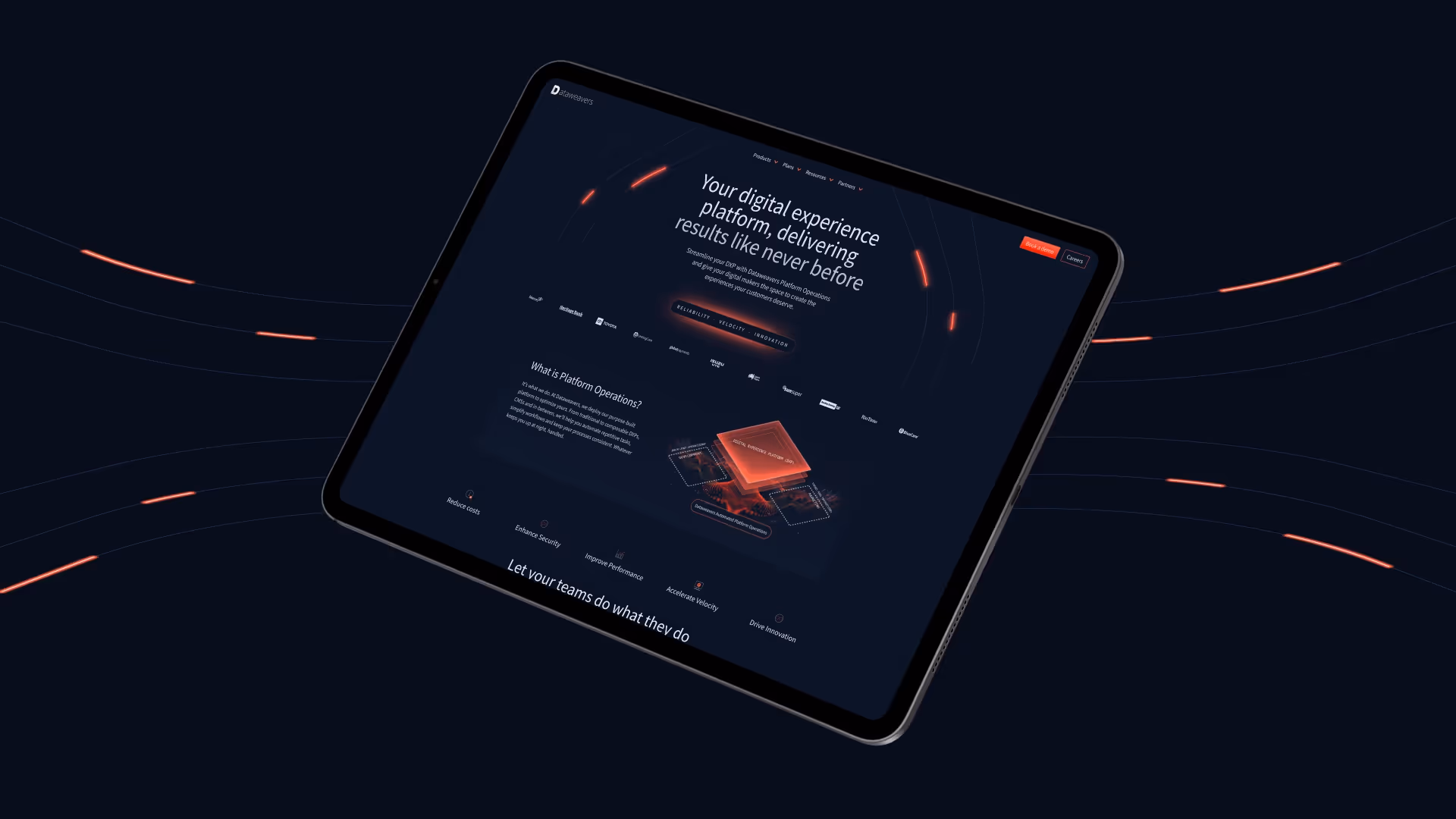
Dataweavers
Dataweavers is a strong example of a B2B website where conversion depended on making a complex, technical offer easier to understand. The work focused on shaping the site around the questions a senior buyer needs answered before speaking to sales: what the platform does, why it matters commercially, how it fits into existing digital operations, and why Dataweavers can be trusted to deliver it.
By aligning the website journey, messaging and sales conversation, the site does more of the early-stage explanation, helping prospects arrive with clearer intent and a stronger understanding of the offer.