Skip to main content
Brand and website design that builds trust and clarity in a complex sector
Acuity
Acuity really know their stuff when it comes to public sector pensions, but their brand wasn’t doing them justice.

what we did
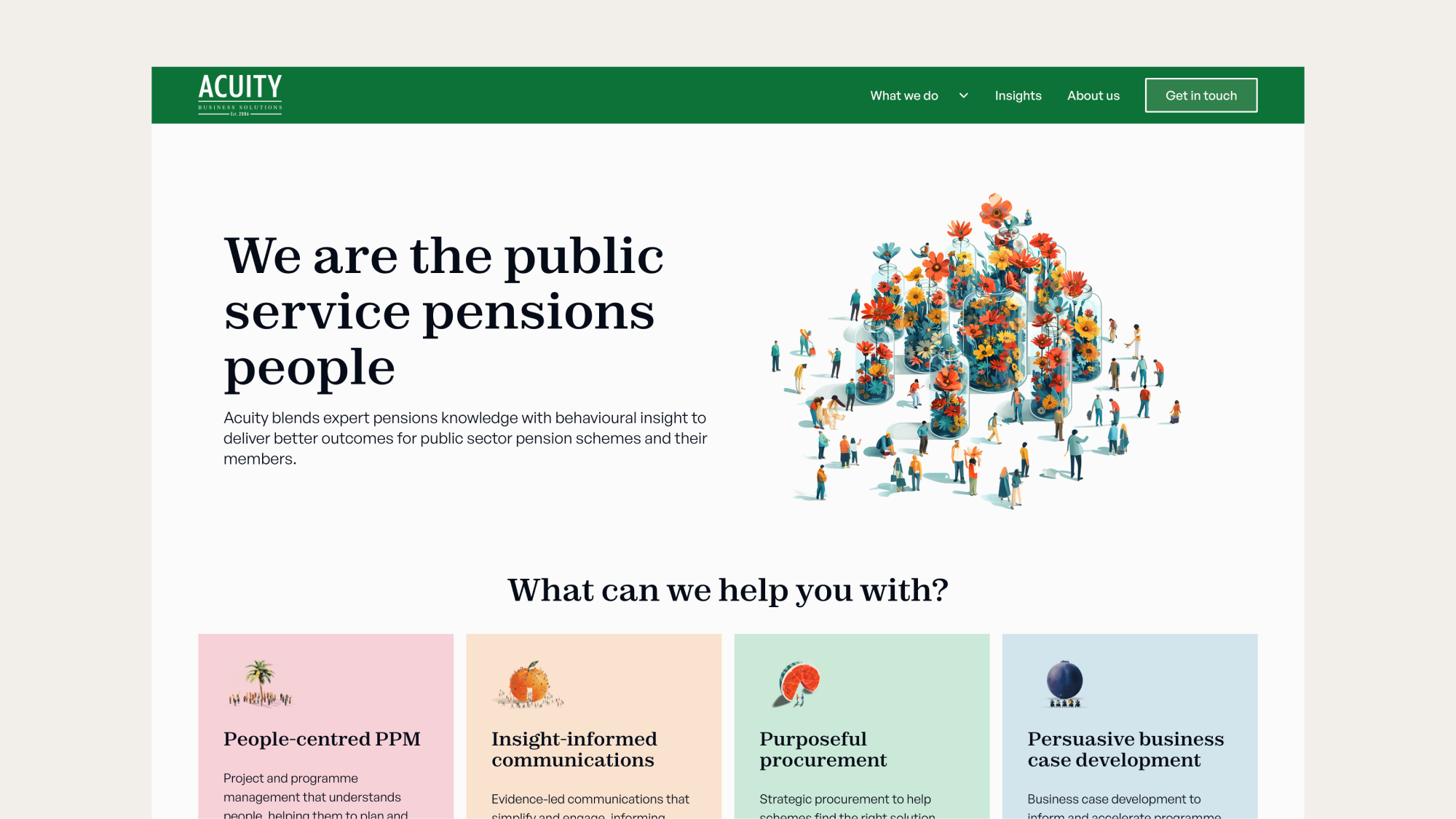
Acuity needed a site that looked as sharp and professional as the work they deliver, without feeling cold or corporate.
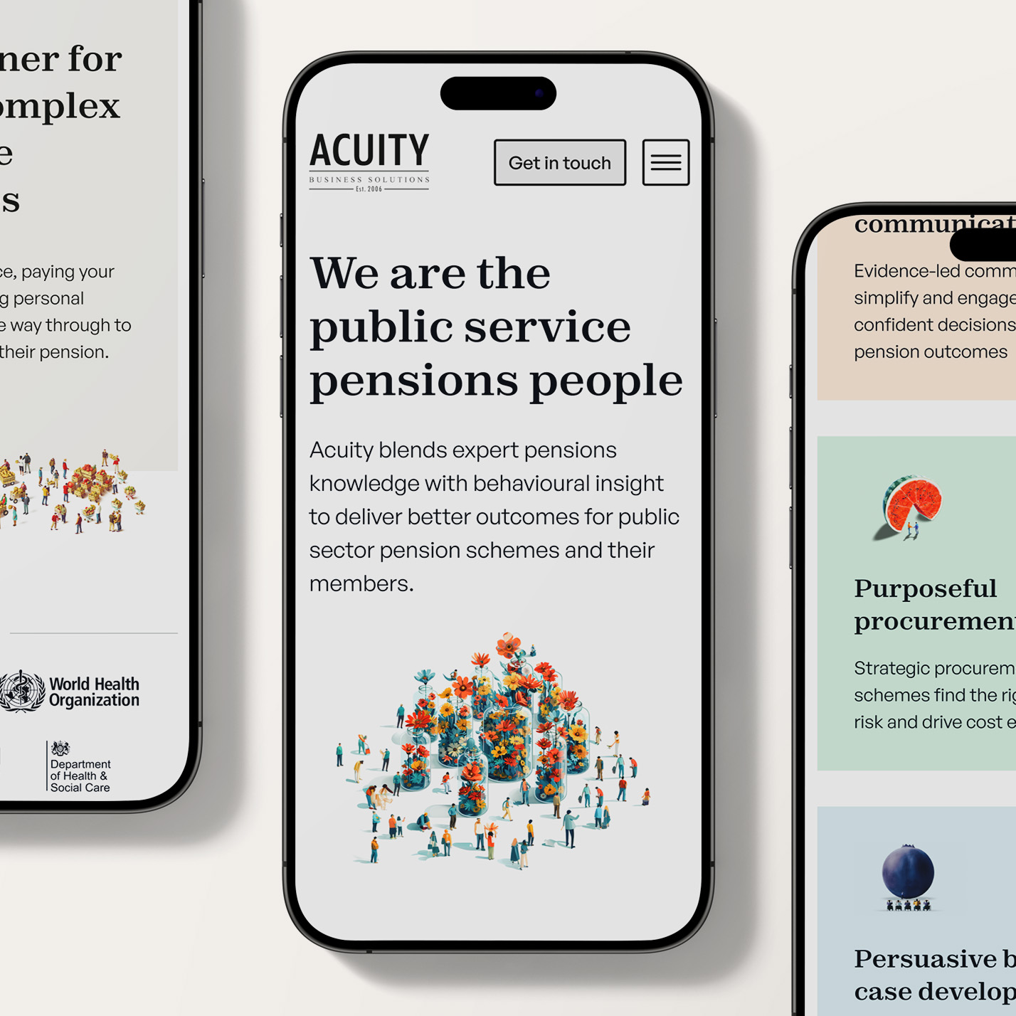
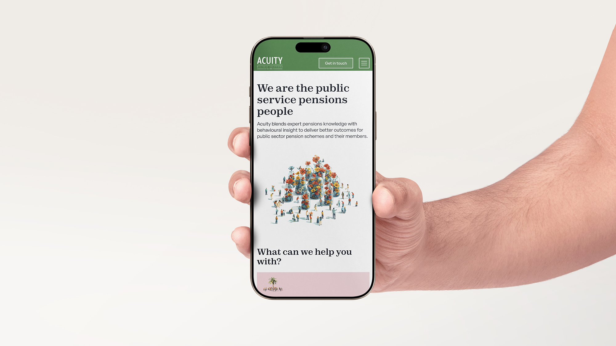
To begin with, we refined their brand identity, keeping their existing logo but expanding the system with a modern colour palette and updated design direction. The goal was to bring a fresh, confident energy to their brand; something that felt current, but still serious enough for the space they work in.
We then designed and built a new website that made what they do clearer. The layout was carefully structured to help visitors quickly understand Acuity’s blend of behavioural insight and practical consultancy, and how that leads to better outcomes for pension schemes and their members.
Now, Acuity’s website does justice to the quality of their work. It helps them show up with confidence, connect with the right people, and back up their experience with something that looks and feels the part.
60% increase in stakeholder engagement on-site, with more time spent on key pages.
New public sector partnerships secured within 3 months of launch, thanks to improved credibility.
Made their complex offer easier to communicate and act on.


Ohana was very responsive and helped us on time throughout the whole process.
Sarah Freeman Thomas
-
Business Manager