Making a product easier to understand with a refreshed brand and user-first website
TravelTime
Making complex API's easier to understand.
what we did
Travel Time needed a brand and website that made their product easier to understand — not just for developers, but for decision-makers too. What they had felt outdated and overly technical, which made it harder to connect with the growing commercial audience they were reaching.
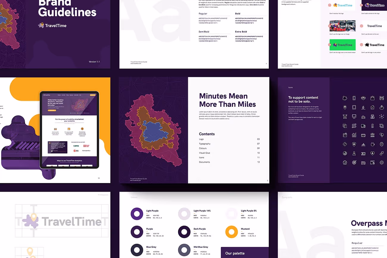
We stepped in to deliver a brand and website update that could act as a strategic stopgap while their team worked on a longer-term rebrand. The goal was to elevate their visual identity and digital presence so it matched the quality and sophistication of their B2B SaaS product.
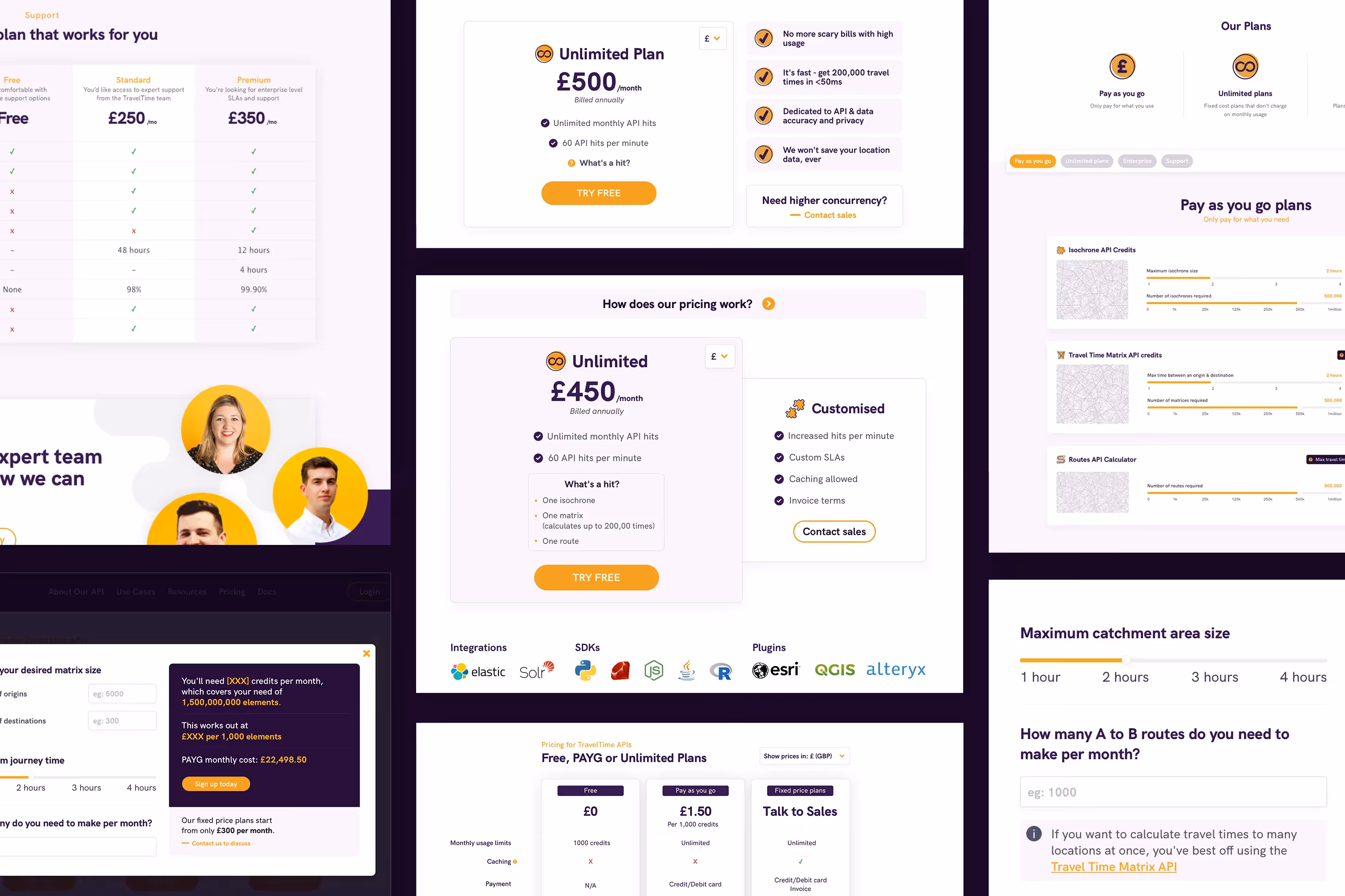
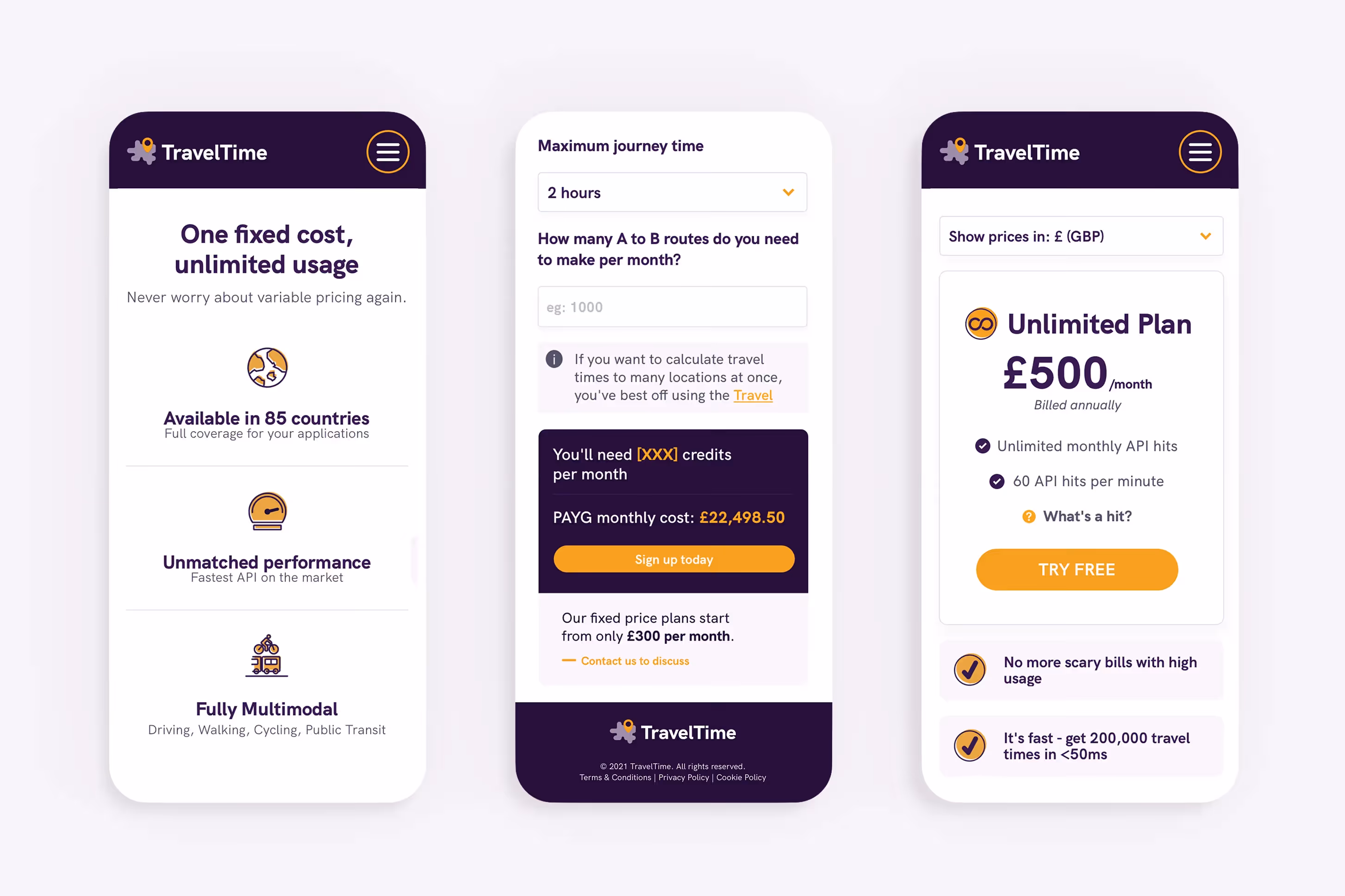
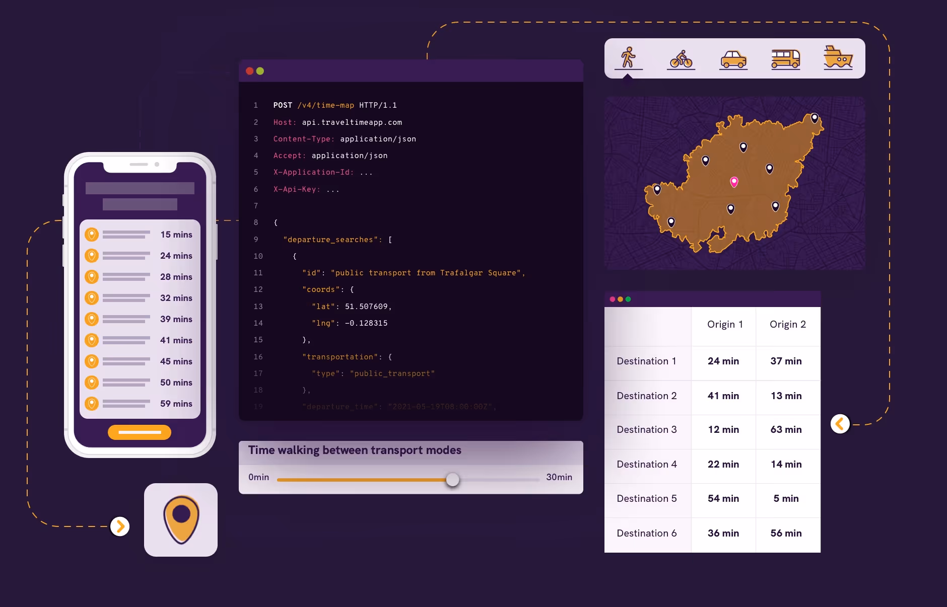
On the website side, we focused on UX strategy and interface design. We created clearer user journeys, simplified the navigation, and restructured key pages to make their offering easier to explore. Now, it’s easier for people to understand what Travel Time does and why it’s valuable, without needing a technical background.